DEVELOPING THE BRAND
︎
We began thinking about our brand by performing a visual analysis of our competitors. We created a spreadsheet, then parsed through our findings by affinity diagraming key takeaways.
︎
We began thinking about our brand by performing a visual analysis of our competitors. We created a spreadsheet, then parsed through our findings by affinity diagraming key takeaways.
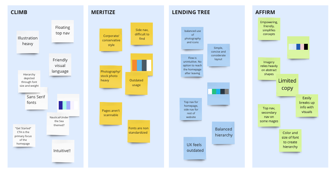
Key Takeaways:
• Using a simple, clear font is integral to the flow. All the competitors reviewed used sans serif fonts that presented as concise and modern.
• Most competitors used hues of blue. We found opportunity to differentiate by using a warmer, more vibrant color palette.
•Of the competitors we reviewed, the most successful had top navs, clear hierarchy and a good balance of information to cohesive and inviting brand identities.
FINAL BRAND VALUES
︎
︎