The YMCA
UI ︎ Product Design ︎ Branding
THE BRIEF
︎
The YMCA app aims to increase gym engagement by helping its users meet their fitness goals. The app gauges the user’s current level of fitness and builds custom daily workouts, nutrition guides, and data visuals to help users along their journey to better health and wellness.
The Team:
Kyle Cocina
Bianca Srivastava
My Role:
Product designer
Branding
DEFINING THE PROBLEM
︎
What do we want to achieve?
The journey to a healthier, more robust lifestyle can be challenging and personal. There is no one-size-fits all for feeling your best. The YMCA app aims to be an in-pocket personal trainer that the users can connect with.
WHO ARE WE DESIGNING FOR?

Erin, 28, elementary school teacher
Goals
• To be able to work out at least 3-5 times a week
• To have a tailored workout routine that fits her health condition
Needs
• To be able to communicate with a health professional
• A product that will keep her accountable for her fitness
Frustrations
• Doesn’t have enough time to juggle all aspect of her life
• Has a health condition that limits her workout options
By creating an encouraging, accessible, and active product to navigate her personal fitness journey while keeping her accountable and on-track.
DEVELOPING THE BRAND
︎
We began thinking about our brand by performing a visual analysis of our competitors. We created a spreadsheet, then parsed through our findings by affinity diagraming key takeaways.
Our top competitors were:
Nike Training, Peleton and Strava
︎
We began thinking about our brand by performing a visual analysis of our competitors. We created a spreadsheet, then parsed through our findings by affinity diagraming key takeaways.
Our top competitors were:
Nike Training, Peleton and Strava
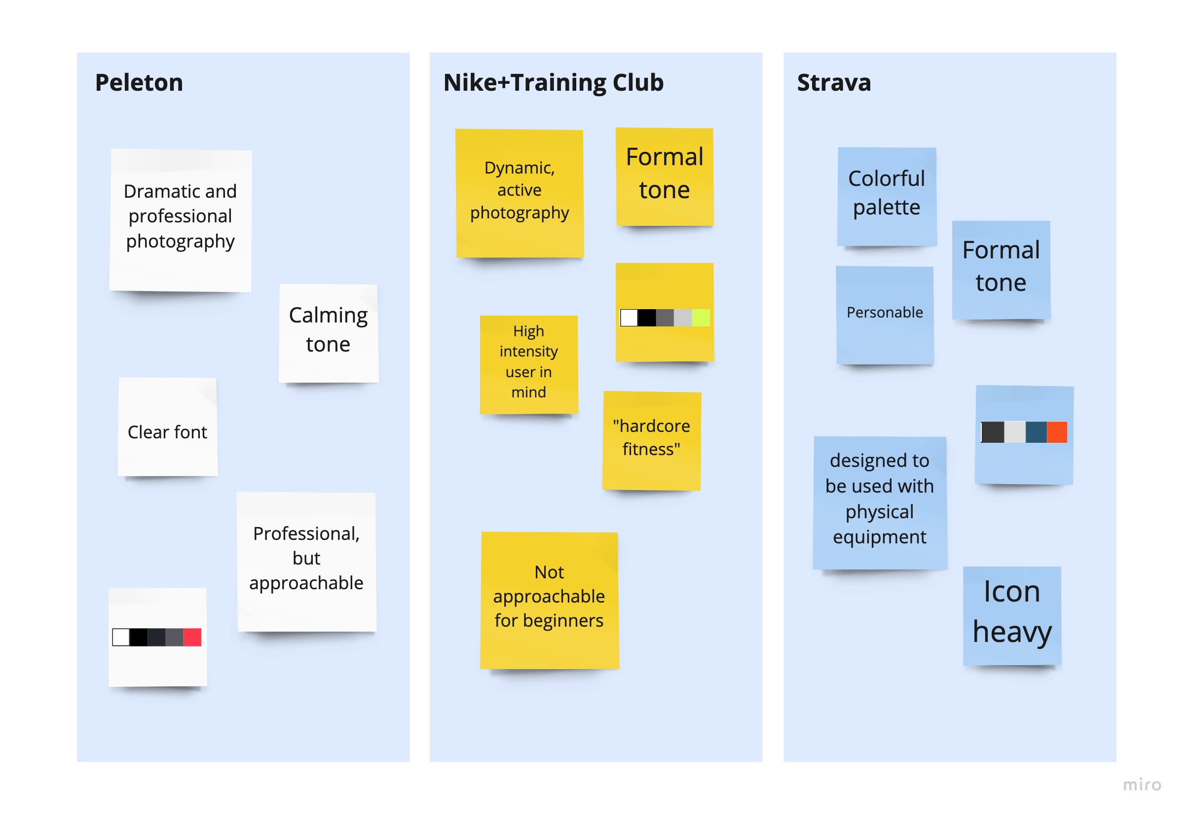
Key Market Takeaways:
•The current market appeals to people already interested in and knowledgeable about fitness.
• There is an opportunity to cater to those that want to become fit and don’t have the knowledge or resources.
• There is opportunity to created tailored workouts to fit the needs of those that are physically compromised.
Key Visual Takeaways:
• The current brand visuals are modern and streamlined
• Brand identities are focused on optimization and masculinity
• There is an opportunity for color and graphics, without compromising optimization. Since we are providing tailored workouts to those with health conditions, a more approachable tone should be explored.