MOODBOARD EXPLORATION
To begin the redesign, the team decided to create 3 divergent concepts (1 per designer), in order to give the client more options. In this exploration, I focused on a monochromatic color scheme with a vibrant green accent, complemented by friendly line drawings. The green was integral in communicating neutrality and growth while also appealing to the millenial demographic with its bright, eye catching tone.
STYLE TILE EXPLORATION
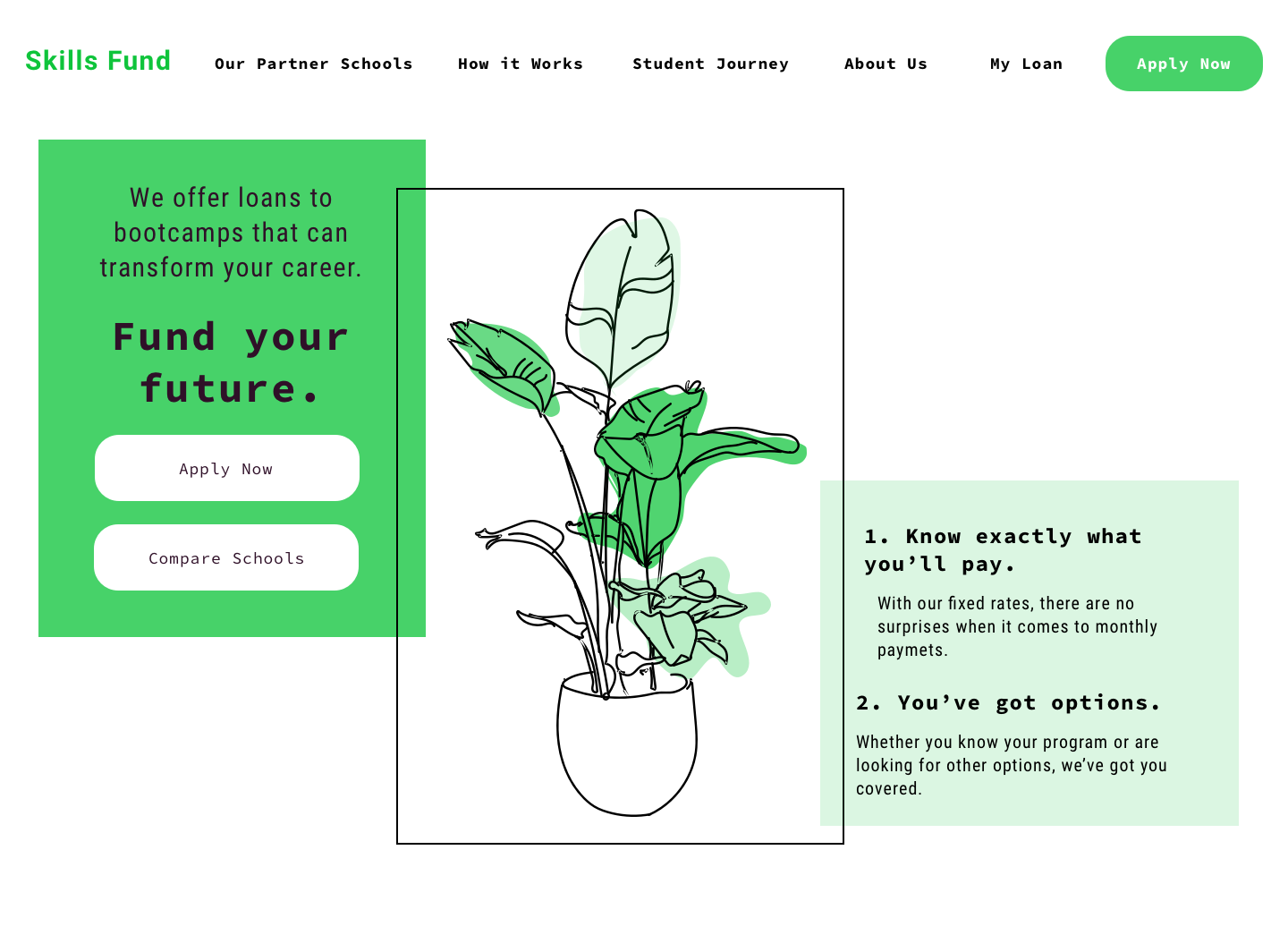
With the moodboard as reference, I began honing in on the identity by creating illustrations and UI elements. I explored the theme of career growth through plant imagery, using specifically office plants to relate more literally to the subject while retaining the analogy. As per client recommendations, I toned the green down to a more subtle, natural tone.
User Interviews
After creating moodboards and style tiles, we presented materials to our users. After providing a brief project overview, we asked them:
Q1.
How the tone was being presented
Q2.
How trustworthy they found the identity to be
Q3.
If there were any elements that were standing out in particular
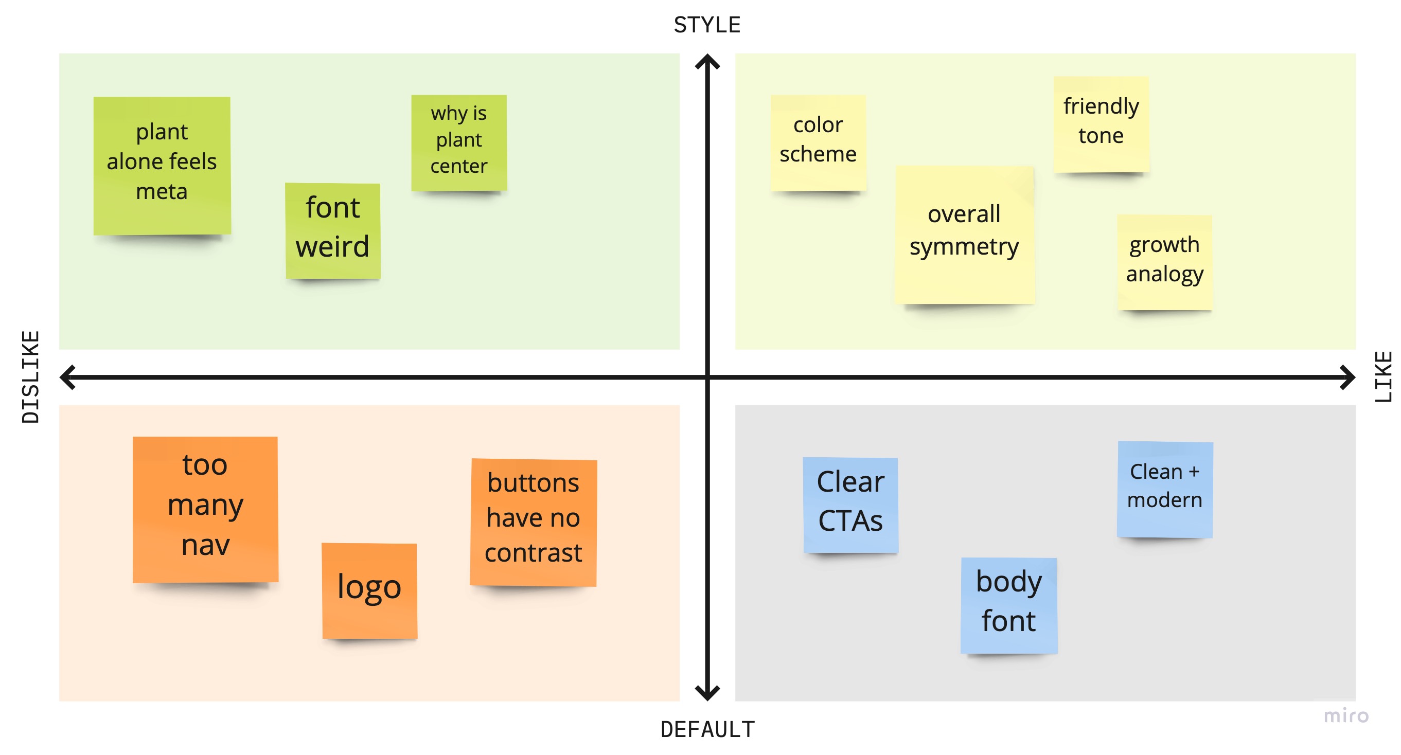
User Takeaways
85%
of users reacted positively to the hand drawn illustrations and color palette. They felt like the site was casual and personable, and could be trusted.
40%
of users were confused about the type choice.
40%
of users liked the illustrations but found the center alignment of the graphic to be distracting.
Once I had tested my visual direction with users, I created a style guide to define the broader visual system of the website. I specified typography, imagery and color palette to inform the tone of the identity.
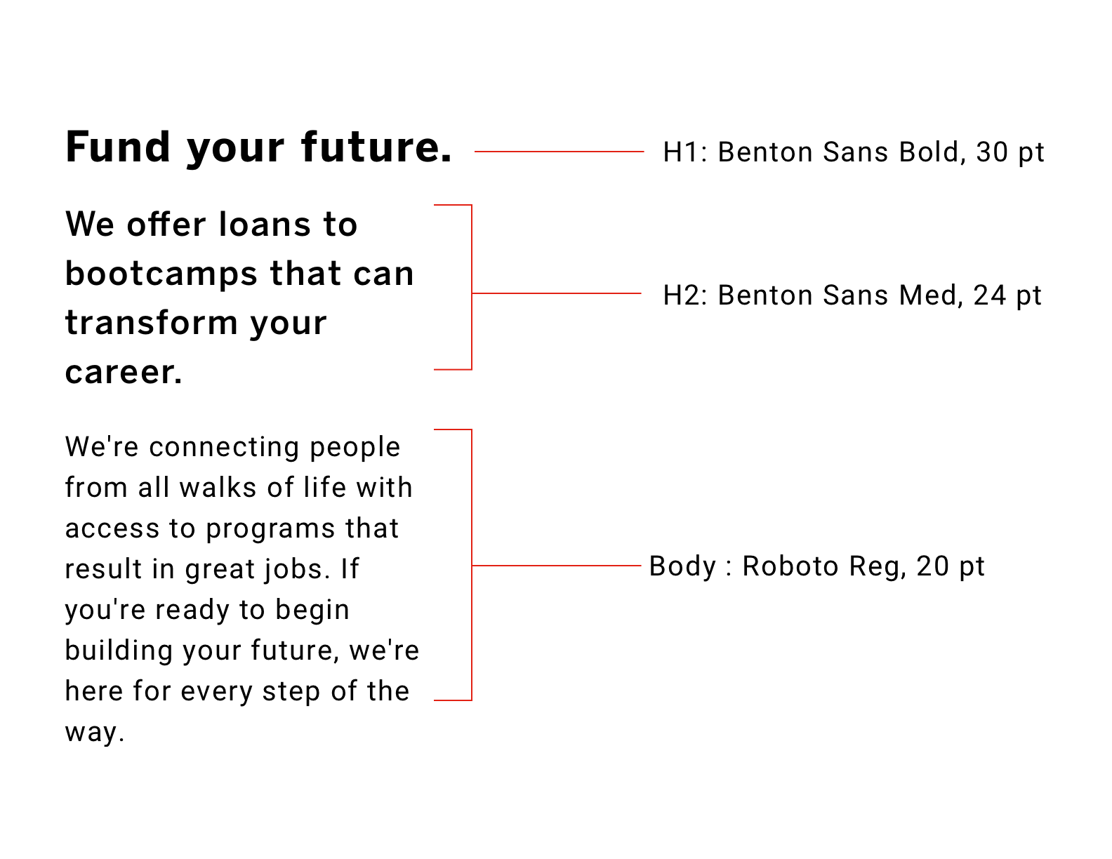
TYPOGRAPHY
The fonts were chosen for their legibility and clarity. Both primary typefaces are sans serif fonts. Fonts are constrained to only 2 typefaces for simplicity purposes.

IMAGERY
The illustrations are meant to convey growth and vibrance. The hand-drawn style is casual and personable and encourages the user to interact with the content. All illustrations were hand drawn by me.
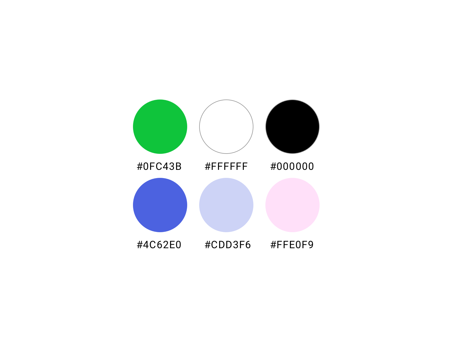
COLOR
The colors were chosen to convey vibrance and vigor, but also sophistication and trust. The staple green is gender-neutral and energizing. The complementary colors add softness to the green and serve as block tones.

UI ELEMENTS
The UI Elements were designed with simplicity and clairity in mind, while stylistically remaining consistent with the rest of the interface. The clients expressed wanting a high contrast between the button’s active and inactive state, thus the decision to go with black and white buttons (black being the active state). With the focus being on getting students to apply for loans, the “apply now” button was pulled from the button system and given a periwinkle fill. The result being a soft nudge towards the CTA, without being overbearing and taking away from the rest of the content.