Once I had tested my visual direction with users, I created a style guide to define the broader visual system of the website. I specified typography, imagery and color palette to inform the tone of the identity.
Once I had tested my visual direction with users, I created a style guide to define the broader visual system of the website. I specified typography, imagery and color palette to inform the tone of the identity.
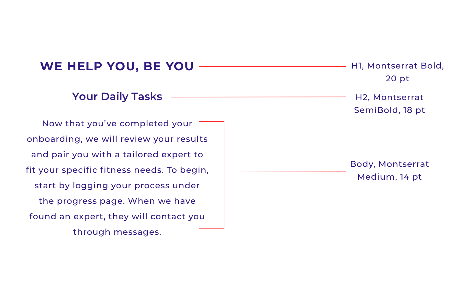
TYPOGRAPHY
The typography is meant to be clear and action-oriented. I wanted to steer away from the aggressive, bold type that is routinely associated with fitness, and convey hierarchy by using semi-bold, all caps headings instead..
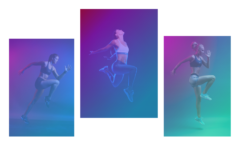
IMAGERY
The imagery is used sparingly. Photography depicts action, with a gradient background and colorful lighting to mimic the colors used in the UI.
COLOR
Color is used in soft gradients, with an electric blue-purple shade used in CTAs and selections. I wanted the overall atmosphere the app to feel relaxing and inviting, with bright color used to emphasize type and buttons.

UI ELEMENTS
The UI elements are designed to be eye catching, without taking too much away from the text. Gradients are repeated on larger card elements, and buttons are designed to carefully balance the background so that one doesn’t take away from another.