Southwest Airlines: conveying likeability
Brand Review
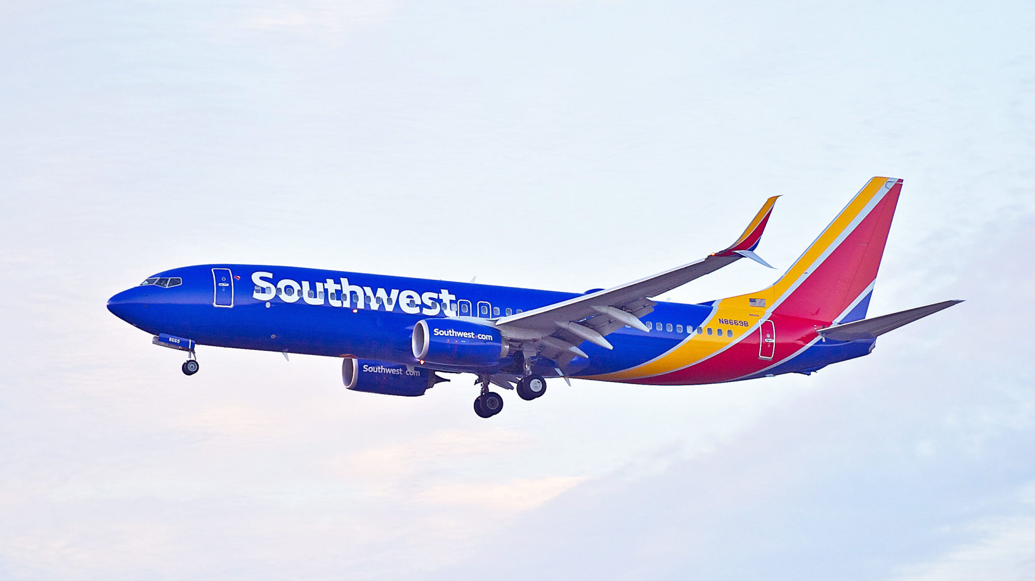
![]()
Established in 1971, Southwest has garnered the reputation of being one of the most beloved domestic airlines in America. From the lively primaries that make up its brand identity, to the playful sans serif and staple tri-colored heart that substitutes for the abruptness of a period, Southwest’s brand exudes likability. Further, the strict adherence to its design system, translating even to the exteriors of its aircrafts, takes its visual identity to a whole other level--literally. Southwest aircrafts distinguish themselves from their more somber eggshell white competitors, Delta and American Airlines, with their bold colors, recognizable from ground level.

The logo went through its first rebrand since 1971 in 2014, changing the typeface to lower case, and adding the heart symbol at the end of the logo. The heart doesn’t speak to the usual associations tied to its symbol. It’s not overly sentimental, effeminate or gooey. Instead, it’s friendly, playful, and inviting. It serves as both an icon that could be used independently, and as a period. For example, instead of Southwest(dot)com, we have Southwest(heart)com. The heart is an easy, fun, versatile addition to the wordmark, but most importantly, it gives the airline a bold identifier. Southwest’s daring visual identity has proved to be a worthwhile investment-- unlike other airline competitors, it conveys a story and a sentiment. It gives the logistical nightmare that is air travel a touch of comfort and reaps the rewards for doing so.