SkillsFund
UI ︎ Product Design ︎ Branding
THE BRIEF
︎
SkillsFund’s mission is to provide access to career-transforming education by offering student loans to those wanting to change career paths. By offering transparent, student first financing, they aim to be the leader in outcome-based education loan options. The team came to us to optimize the company’s online presence.
The Team:
Taurrin LeDe
Hayley Voss
Bianca Srivastava
My Role:
Product designer Branding
Illustration
︎
What do our stakeholders want?

To re-think and restructure the current site’s information architecture.


Who are our users?


Students that are using the website to browse through schools and loans.
PROBLEM STATEMENT
︎
The SkillsFund website needs to communicate transparency and simplicity by having a straightforward, streamlined design system, while also conveying trust by appealing to the millennial demographic.
DEVELOPING THE BRAND
︎
We began thinking about our brand by performing a visual analysis of our competitors. We created a spreadsheet, then parsed through our findings by affinity diagraming key takeaways.
︎
We began thinking about our brand by performing a visual analysis of our competitors. We created a spreadsheet, then parsed through our findings by affinity diagraming key takeaways.
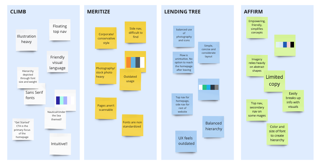
Key Takeaways:
• Using a simple, clear font is integral to the flow. All the competitors reviewed used sans serif fonts that presented as concise and modern.
• Most competitors used hues of blue. We found opportunity to differentiate by using a warmer, more vibrant color palette.
•Of the competitors we reviewed, the most successful had top navs, clear hierarchy and a good balance of information to cohesive and inviting brand identities.
FINAL BRAND VALUES
︎
︎
TRANSPARENT
INTUITIVE
ENCOURAGING
MOODBOARD EXPLORATION
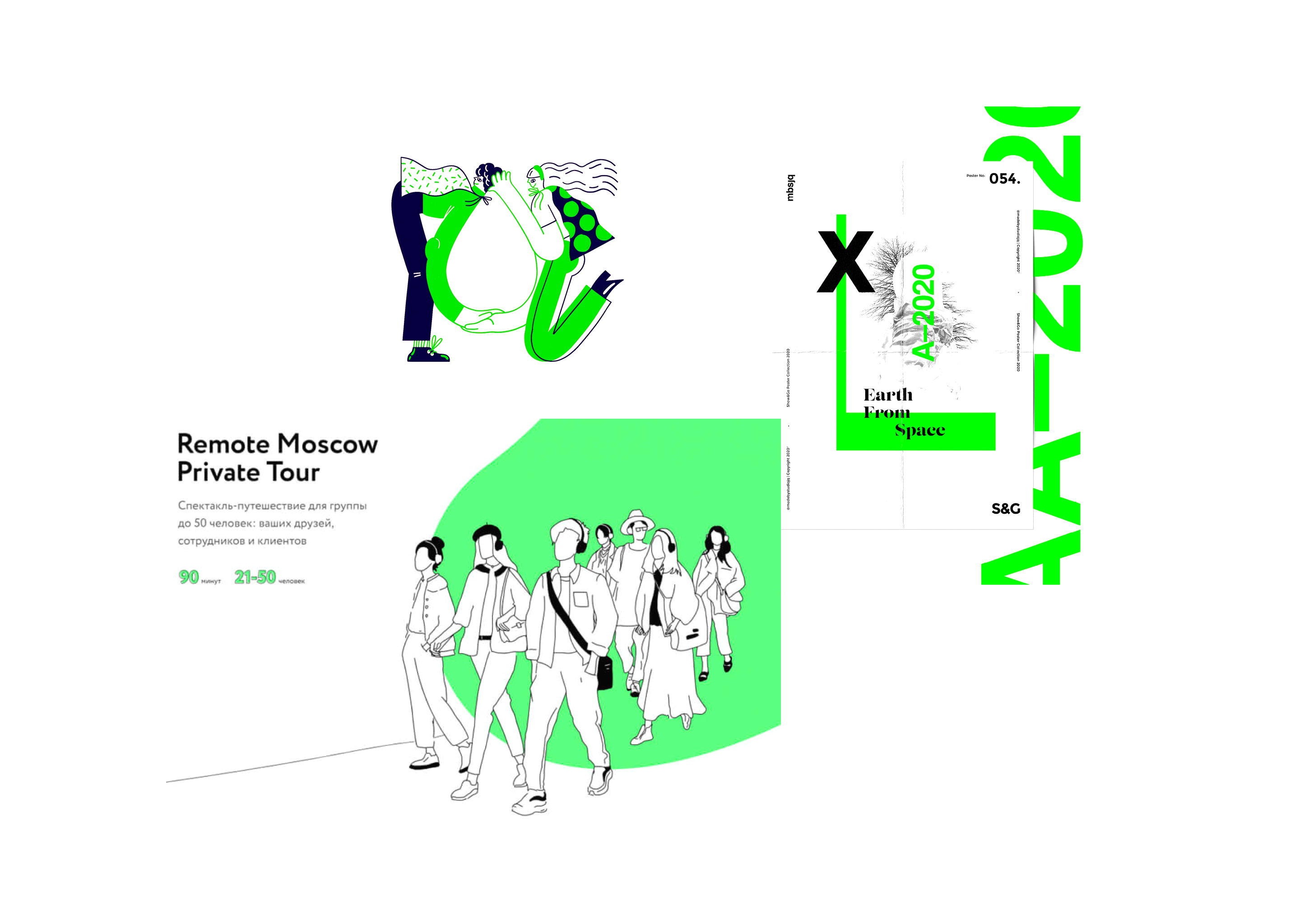
To begin the redesign, the team decided to create 3 divergent concepts (1 per designer), in order to give the client more options. In this exploration, I focused on a monochromatic color scheme with a vibrant green accent, complemented by friendly line drawings. The green was integral in communicating neutrality and growth while also appealing to the millenial demographic with its bright, eye catching tone.
STYLE TILE EXPLORATION
With the moodboard as reference, I began honing in on the identity by creating illustrations and UI elements. I explored the theme of career growth through plant imagery, using specifically office plants to relate more literally to the subject while retaining the analogy. As per client recommendations, I toned the green down to a more subtle, natural tone.
User Interviews
After creating moodboards and style tiles, we presented materials to our users. After providing a brief project overview, we asked them:
Q1.
How the tone was being presented
Q2.
How trustworthy they found the identity to be
Q3.
If there were any elements that were standing out in particular
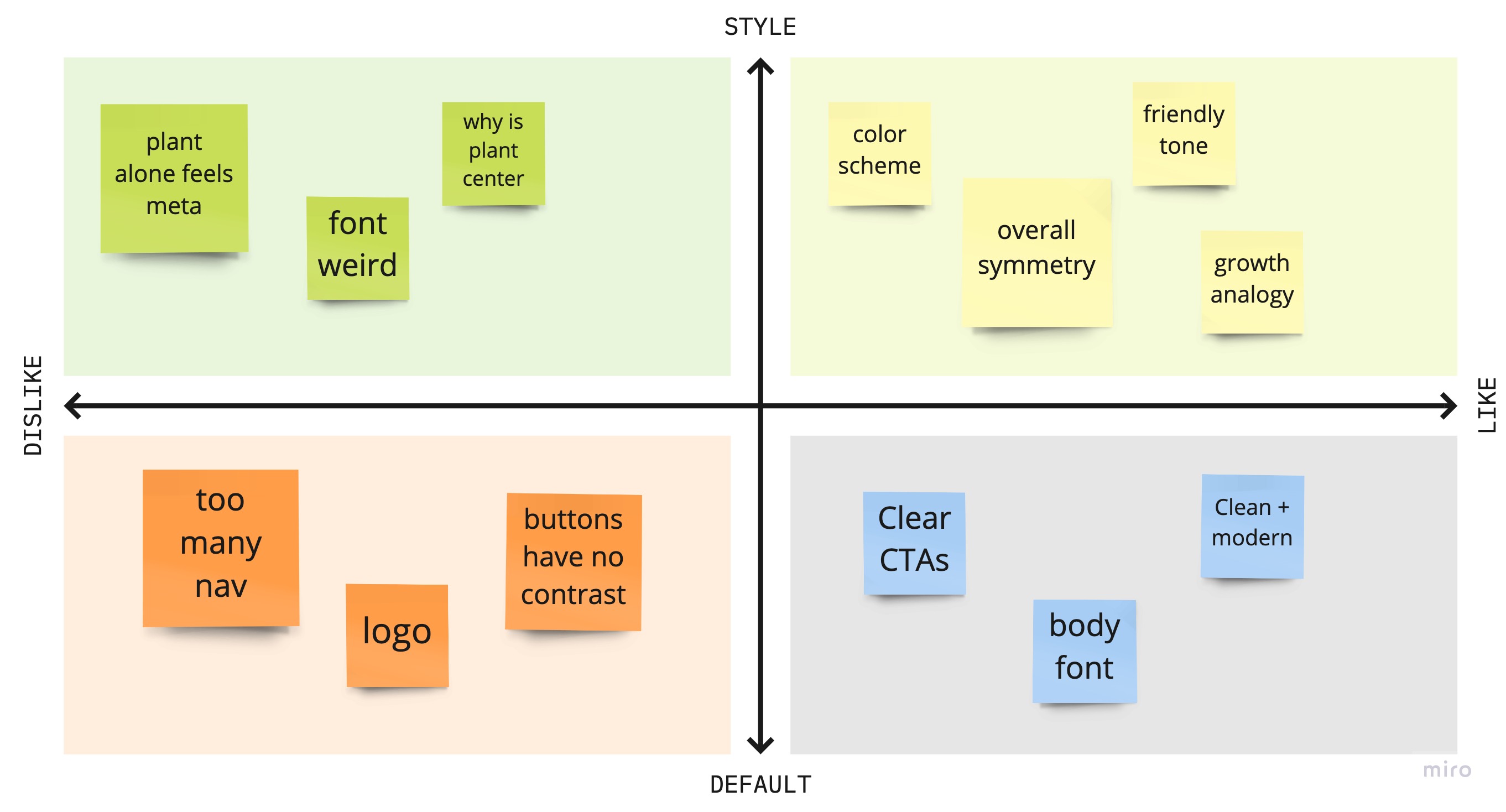
User Takeaways
85%
of users reacted positively to the hand drawn illustrations and color palette. They felt like the site was casual and personable, and could be trusted.
40%
of users were confused about the type choice.
40%
of users liked the illustrations but found the center alignment of the graphic to be distracting.
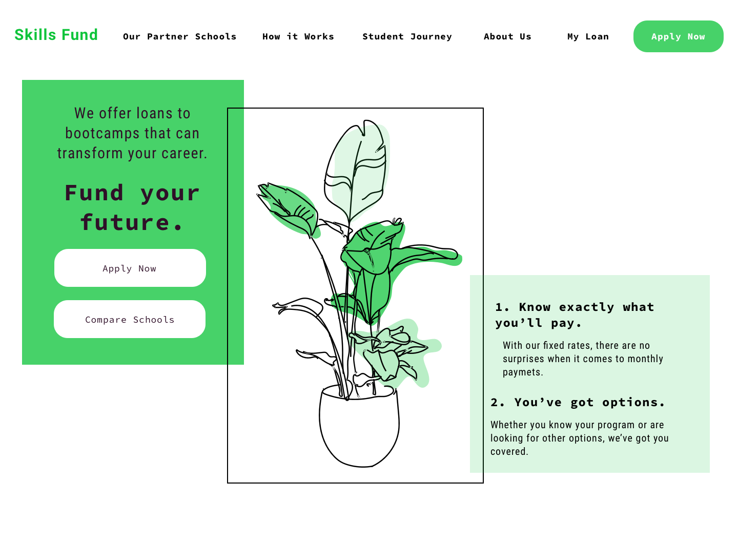
Once I had tested my visual direction with users, I created a style guide to define the broader visual system of the website. I specified typography, imagery and color palette to inform the tone of the identity.
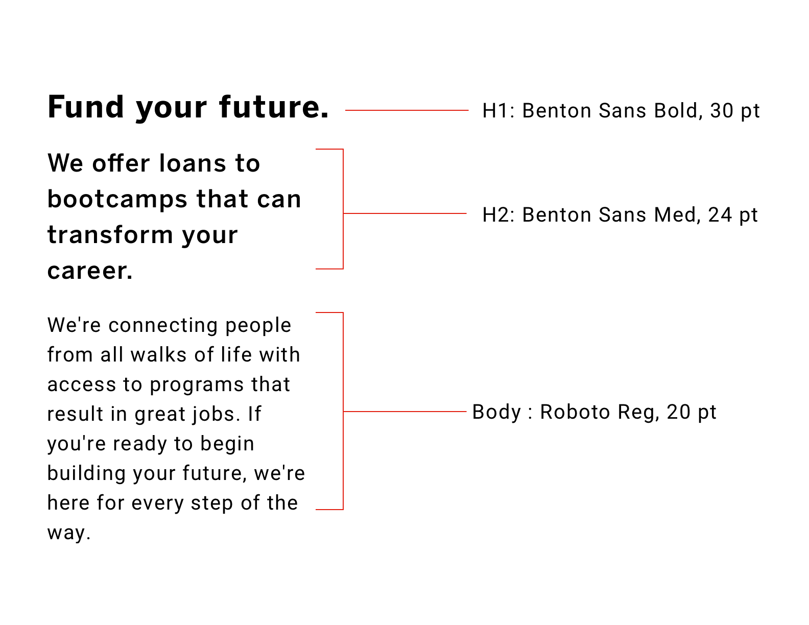
TYPOGRAPHY
The fonts were chosen for their legibility and clarity. Both primary typefaces are sans serif fonts. Fonts are constrained to only 2 typefaces for simplicity purposes.

IMAGERY
The illustrations are meant to convey growth and vibrance. The hand-drawn style is casual and personable and encourages the user to interact with the content. All illustrations were hand drawn by me.
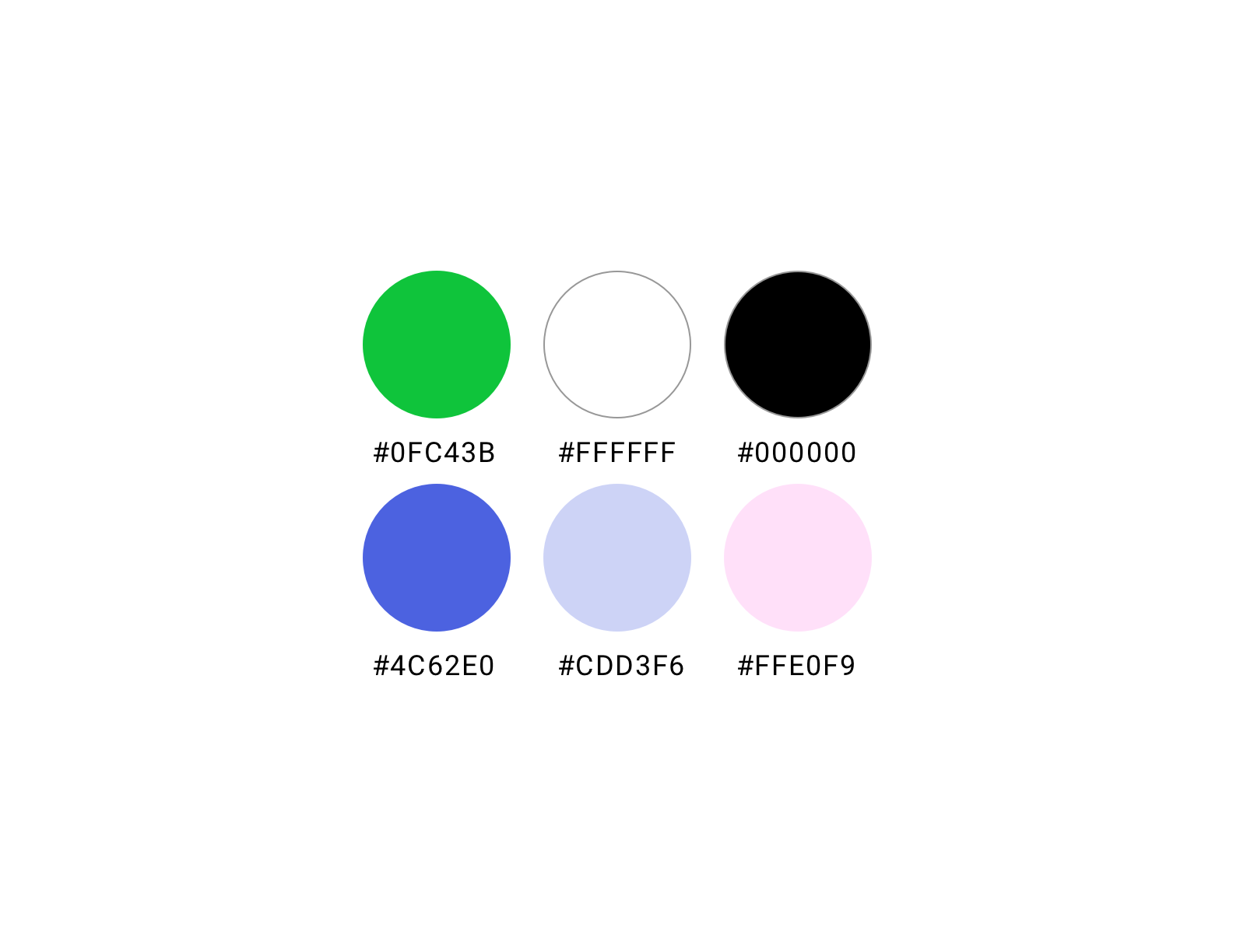
COLOR
The colors were chosen to convey vibrance and vigor, but also sophistication and trust. The staple green is gender-neutral and energizing. The complementary colors add softness to the green and serve as block tones.

UI ELEMENTS
The UI Elements were designed with simplicity and clairity in mind, while stylistically remaining consistent with the rest of the interface. The clients expressed wanting a high contrast between the button’s active and inactive state, thus the decision to go with black and white buttons (black being the active state). With the focus being on getting students to apply for loans, the “apply now” button was pulled from the button system and given a periwinkle fill. The result being a soft nudge towards the CTA, without being overbearing and taking away from the rest of the content.
BUILDING OUT THE SCREENS
︎
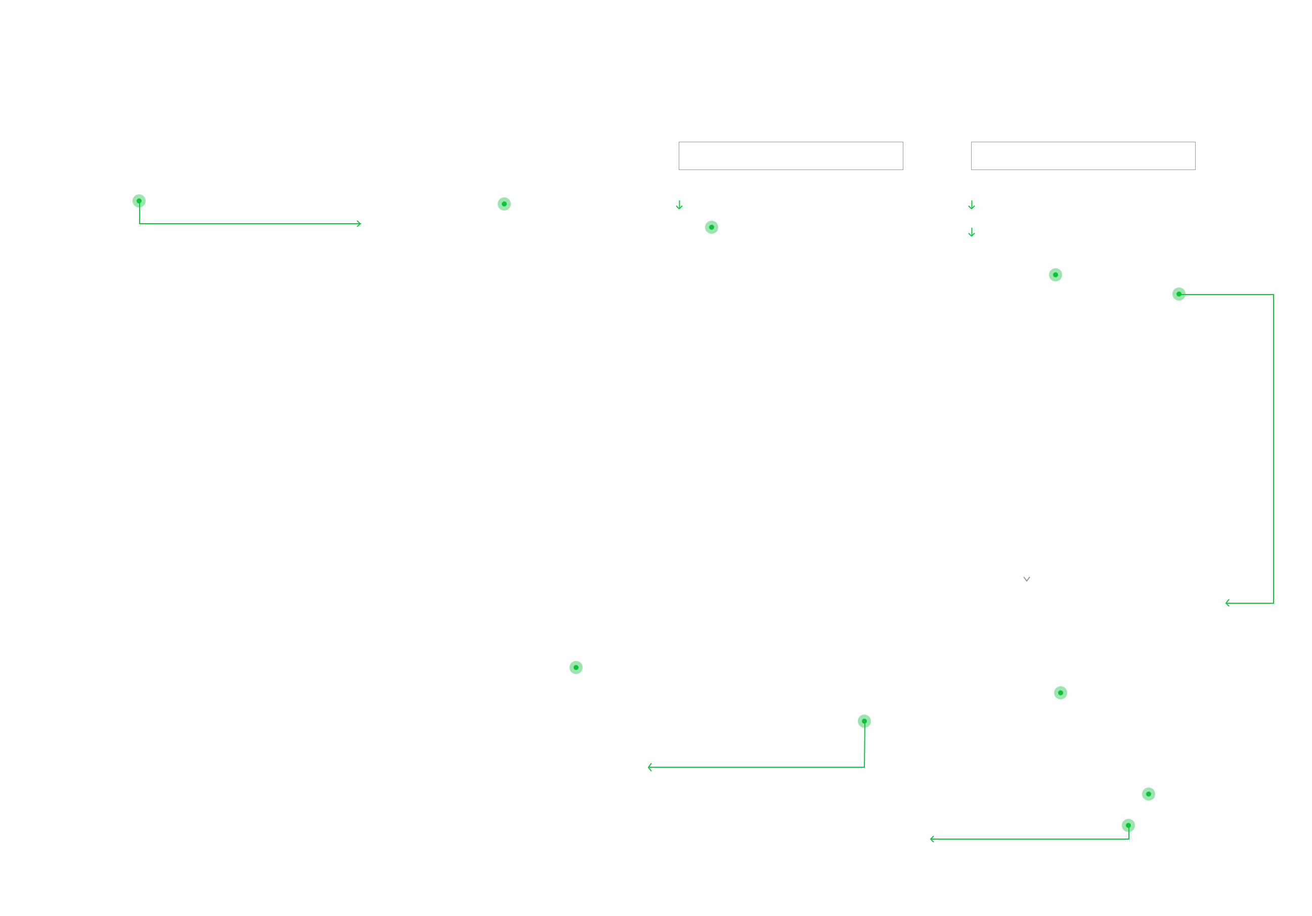
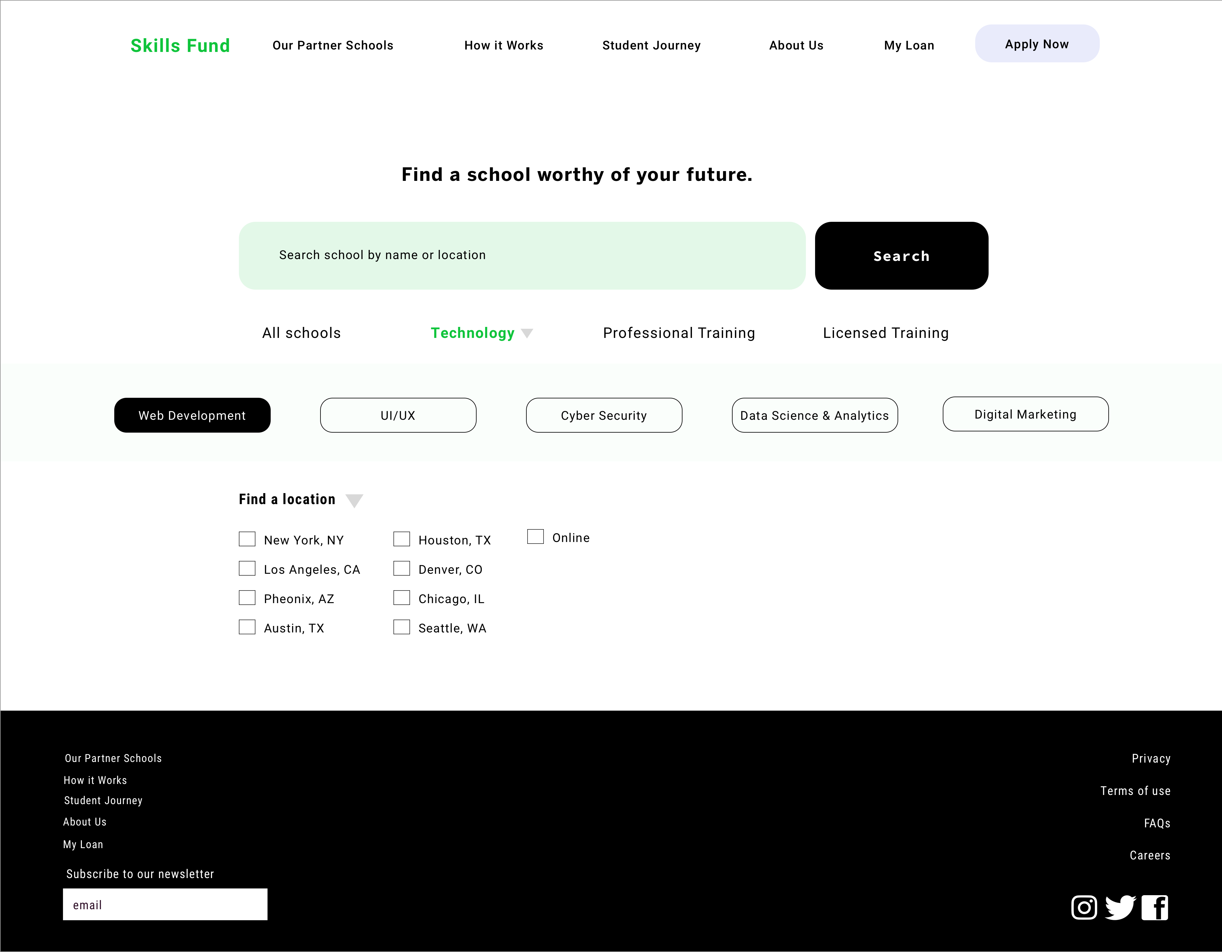
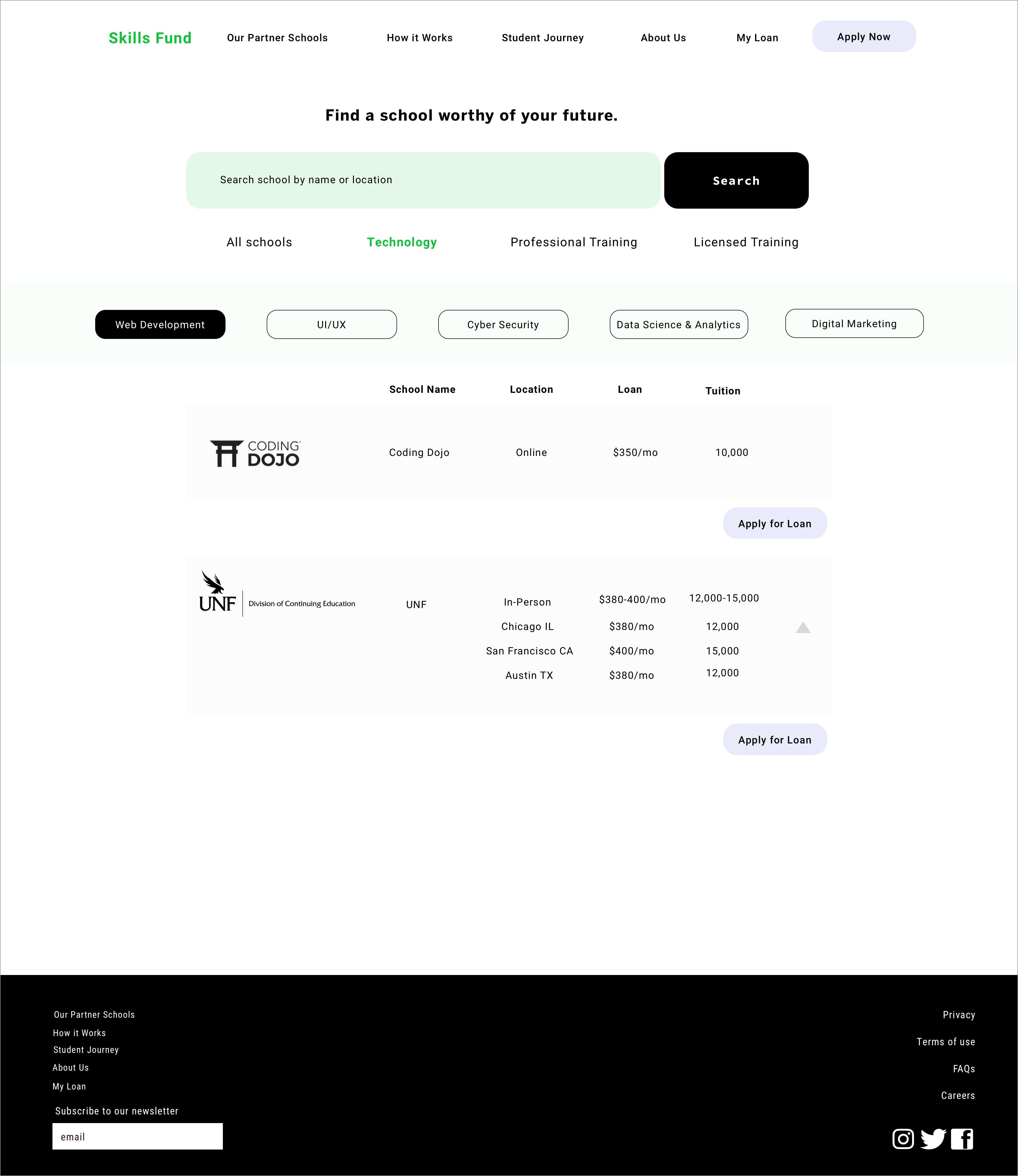
Before building out the screens, I revisited the current website and reworked some elements of the user flow. I then user tested my revisions and ran them by the clients. Shown is the user flow for the user that is still exploring schools, and wants to compare loan options (click to enlarge image).
The result is a more comprehensive set of defining catagories and loan comparing options that allow students to really hone in on an area of study and loan that works for their specific needs.
︎
Before building out the screens, I revisited the current website and reworked some elements of the user flow. I then user tested my revisions and ran them by the clients. Shown is the user flow for the user that is still exploring schools, and wants to compare loan options (click to enlarge image).
The result is a more comprehensive set of defining catagories and loan comparing options that allow students to really hone in on an area of study and loan that works for their specific needs.
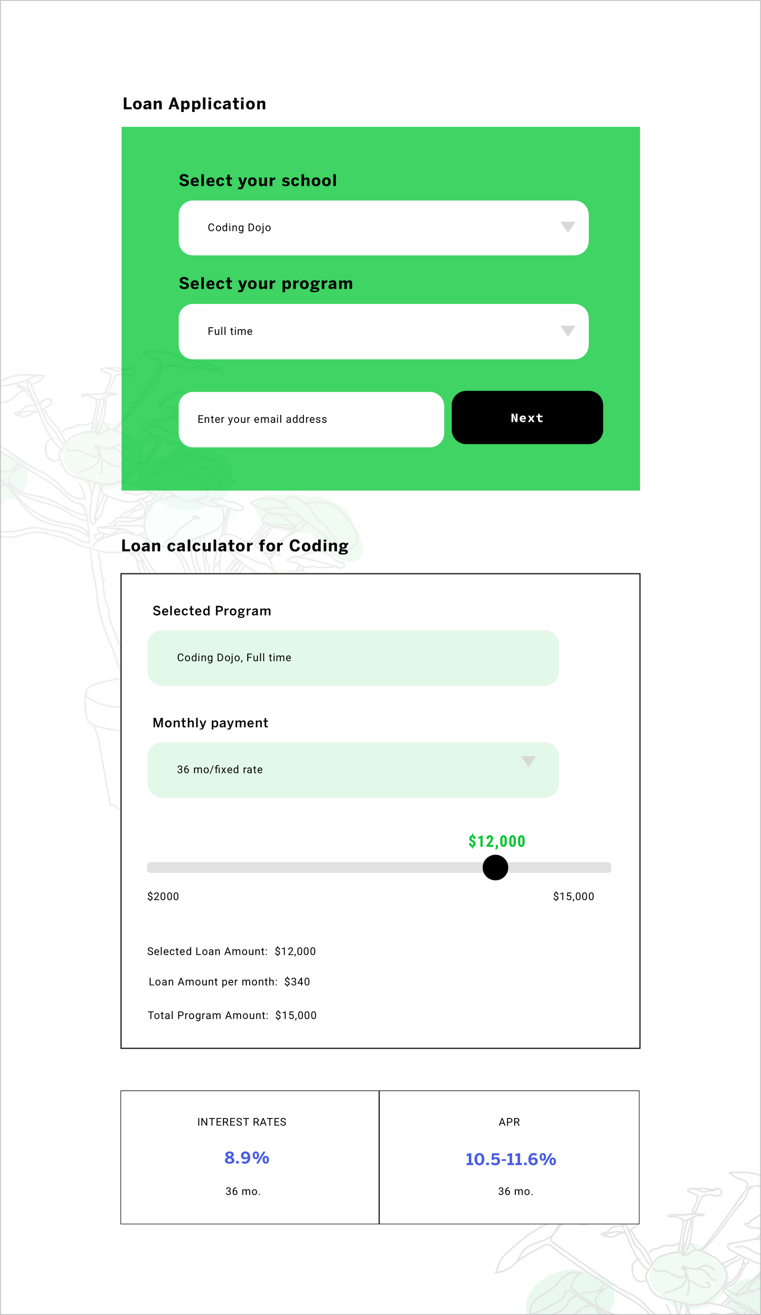
AND CALCULATOR
There were some clarity issues for those applying for a loan that already knew their loan amount, vs those that wanted to calculate their loan before applying to their schools. In the first iteration of screens, the loan calculator auto populated the screen once the school field was filled, making it confusing for those trying to submit their application. I ended up including a separate loan calculator CTA that needed to be manually accessed instead of having one that automatically popped up.
THE LANDING PAGE
![]()
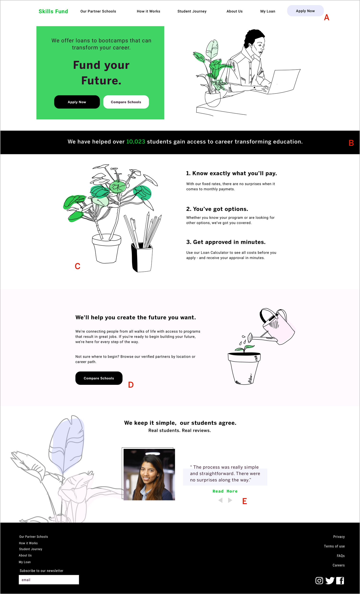
A: The ‘Apply Now’ CTA was originally a darker periwinkle blue than the one that ultimately made it to the final prototype. After receiveing user feedback that the darker CTA was taking away from the primary header and reviewing competitors’ use of nav CTA, I decided to lighten the button, and eventually remove the darker color from the color palette completely.
B: The client wanted to highlight the number of students helped by SkillsFund, so I created a dynamic number tag that would change every time a student’s loan application was approved.
C: The illustration concept was originally going to primarily comprise of potted plants, but after some users expressed confusion about the overall concept, I added office supplies to give the plants more context.
D: One of the client’s goals was to increase traffic on the ‘Compare Schools’ page. To do this, I added an additional compare schools CTA on the home page. Of the users we tested, there was a 30% increase in ‘compare schools’ clicks with the additional button.
E: In the original wireframes, I had a separate page for reviews, with two teaser reviews on the home page that would link to the separate page. After user testing, I found that the extra page was redundant, and streamlined the interviews by making them scrollable on the home page.
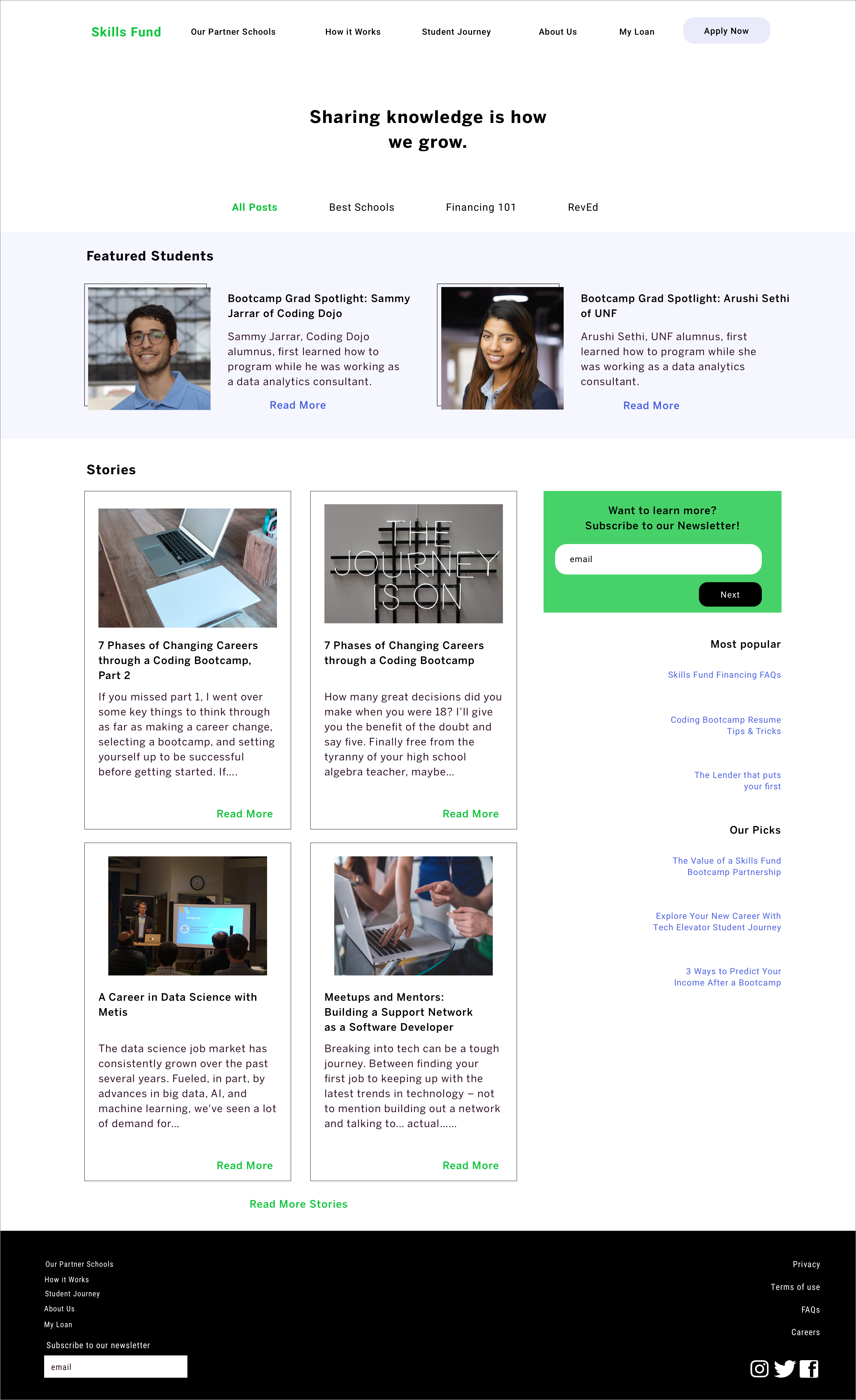
THE PARALLAX SCROLL
First time users found that there was a lot of information to absorb on the first page, and wanted a way to get “digestible bites”. The solution was creating a parallex scroll, so that information would present itself in a delayed manner.
First time users found that there was a lot of information to absorb on the first page, and wanted a way to get “digestible bites”. The solution was creating a parallex scroll, so that information would present itself in a delayed manner.
Example of a dropdown menu transition. Dropdowns are commonly used in this design, especially in the school finder section.
ADDITIONAL SCREENS
PROTOTYPE
FUTURE RECOMMENDATIONS
FOR THE SKILLS FUND TEAM
︎
FOR THE SKILLS FUND TEAM
︎
Test concepts for final design direction
One creative direction or elements of each should be selected to move forward with.
Build the mobile version After selecting a creative direction, the mobile version should be built out based on the desktop design.
Continue accessibility testing As designs are expanded and reduced for different screen sizes, elements should continually be tested to ensure accessibility standards are met.
Leave undecided design decisions to user testing target demographic If the Skills Fund team runs into issues when selecting a final design direction, design decisions should be settled by further user testing among the target demographic.
Test different nav bar verbiage During user testing sessions, users ran into confusion regarding the top nav. Different verbiage should be tested to provide the clearest navigation for users.
PROJECT TAKEAWAYS
What worked:
This project was pretty important for me because it was my first time designing for the web. I found that the extra space (compared to mobile) allowed for flexibility in terms of illustrative components and opportunity for new interactive elements and layouts. Specifically, scroll interactions and hover states. In terms of prototyping and testing, I found that websites are easier for users (and myself) to better conceptualize the product and its implications because it’s a more familiar platform across the board. This resulted in better user feedback and more clarity in the next steps for both myself and the clients.
Pain points:
There are growing pains that come with designing for an unfamiliar platform. Specifically, I had issues with resizing elements and using prototyping tools. I was using Invision to prototype, and while the platform works well for mobile, I routinely had to change sizes during the export and had limited flexibility when it came to animations and transitions. In the future, I want to experiment with Figma for web design and prototyping.