BUILDING OUT THE SCREENS
︎
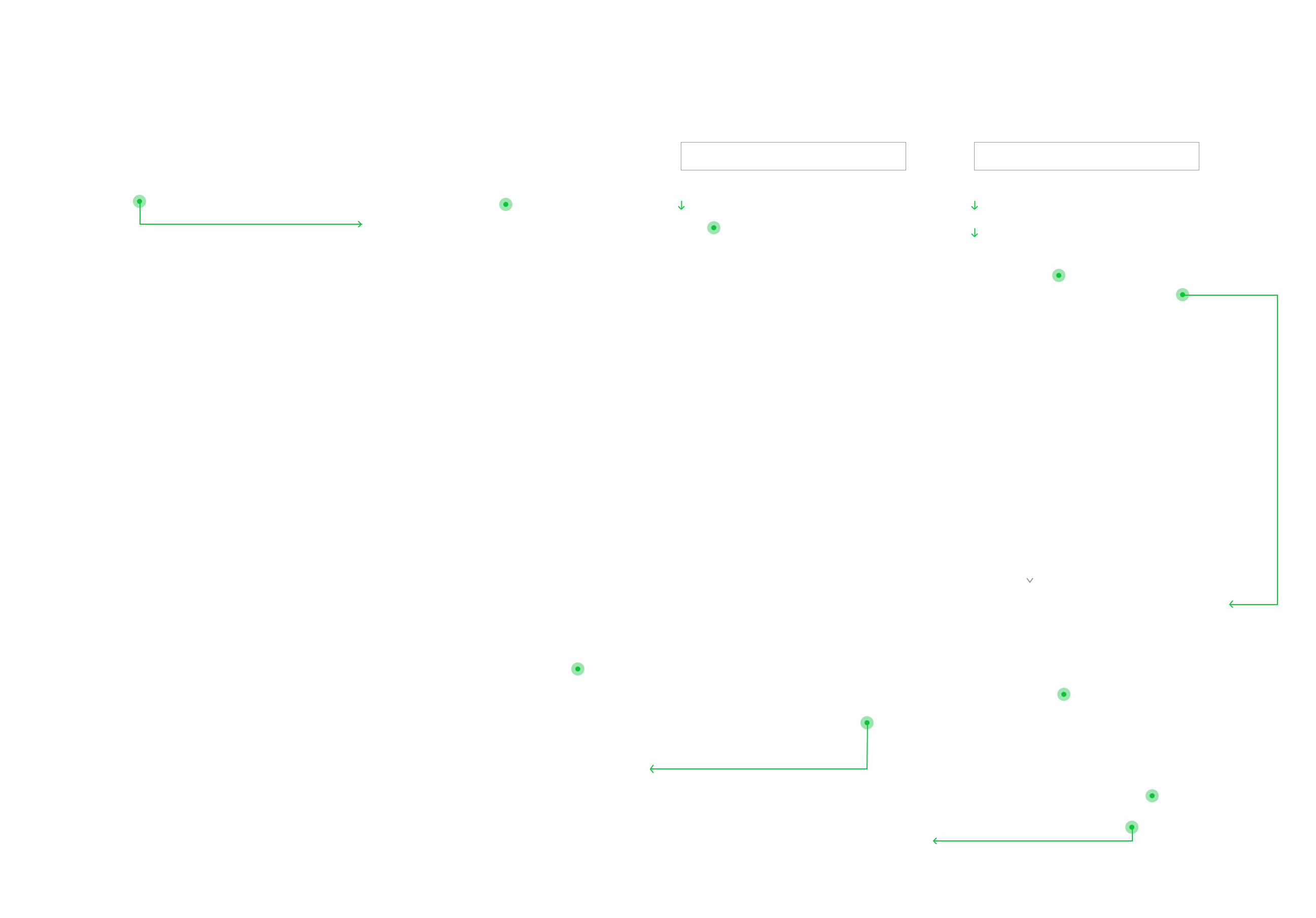
Before building out the screens, I revisited the current website and reworked some elements of the user flow. I then user tested my revisions and ran them by the clients. Shown is the user flow for the user that is still exploring schools, and wants to compare loan options (click to enlarge image).
The result is a more comprehensive set of defining catagories and loan comparing options that allow students to really hone in on an area of study and loan that works for their specific needs.
︎
Before building out the screens, I revisited the current website and reworked some elements of the user flow. I then user tested my revisions and ran them by the clients. Shown is the user flow for the user that is still exploring schools, and wants to compare loan options (click to enlarge image).
The result is a more comprehensive set of defining catagories and loan comparing options that allow students to really hone in on an area of study and loan that works for their specific needs.
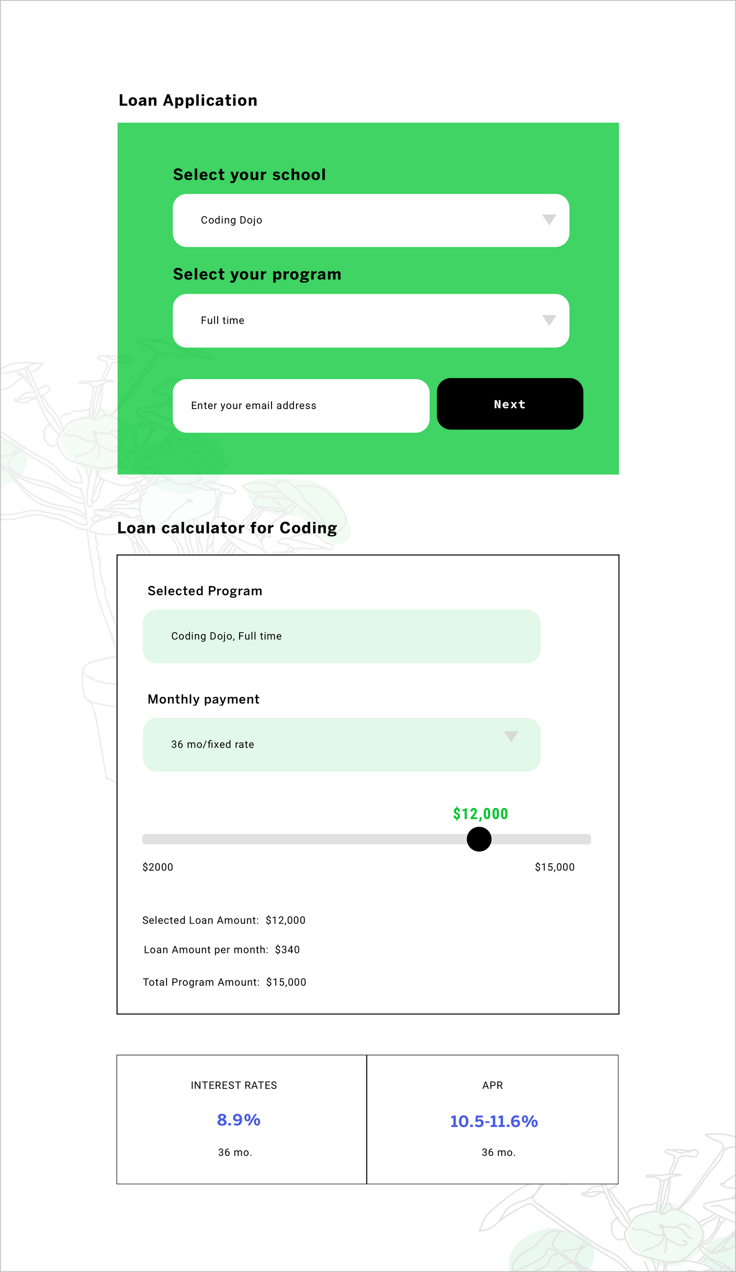
AND CALCULATOR
There were some clarity issues for those applying for a loan that already knew their loan amount, vs those that wanted to calculate their loan before applying to their schools. In the first iteration of screens, the loan calculator auto populated the screen once the school field was filled, making it confusing for those trying to submit their application. I ended up including a separate loan calculator CTA that needed to be manually accessed instead of having one that automatically popped up.
THE LANDING PAGE
![]()
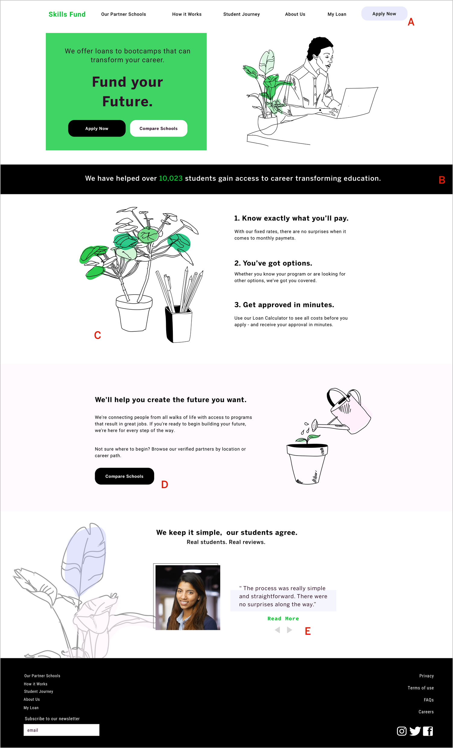
A: The ‘Apply Now’ CTA was originally a darker periwinkle blue than the one that ultimately made it to the final prototype. After receiveing user feedback that the darker CTA was taking away from the primary header and reviewing competitors’ use of nav CTA, I decided to lighten the button, and eventually remove the darker color from the color palette completely.
B: The client wanted to highlight the number of students helped by SkillsFund, so I created a dynamic number tag that would change every time a student’s loan application was approved.
C: The illustration concept was originally going to primarily comprise of potted plants, but after some users expressed confusion about the overall concept, I added office supplies to give the plants more context.
D: One of the client’s goals was to increase traffic on the ‘Compare Schools’ page. To do this, I added an additional compare schools CTA on the home page. Of the users we tested, there was a 30% increase in ‘compare schools’ clicks with the additional button.
E: In the original wireframes, I had a separate page for reviews, with two teaser reviews on the home page that would link to the separate page. After user testing, I found that the extra page was redundant, and streamlined the interviews by making them scrollable on the home page.
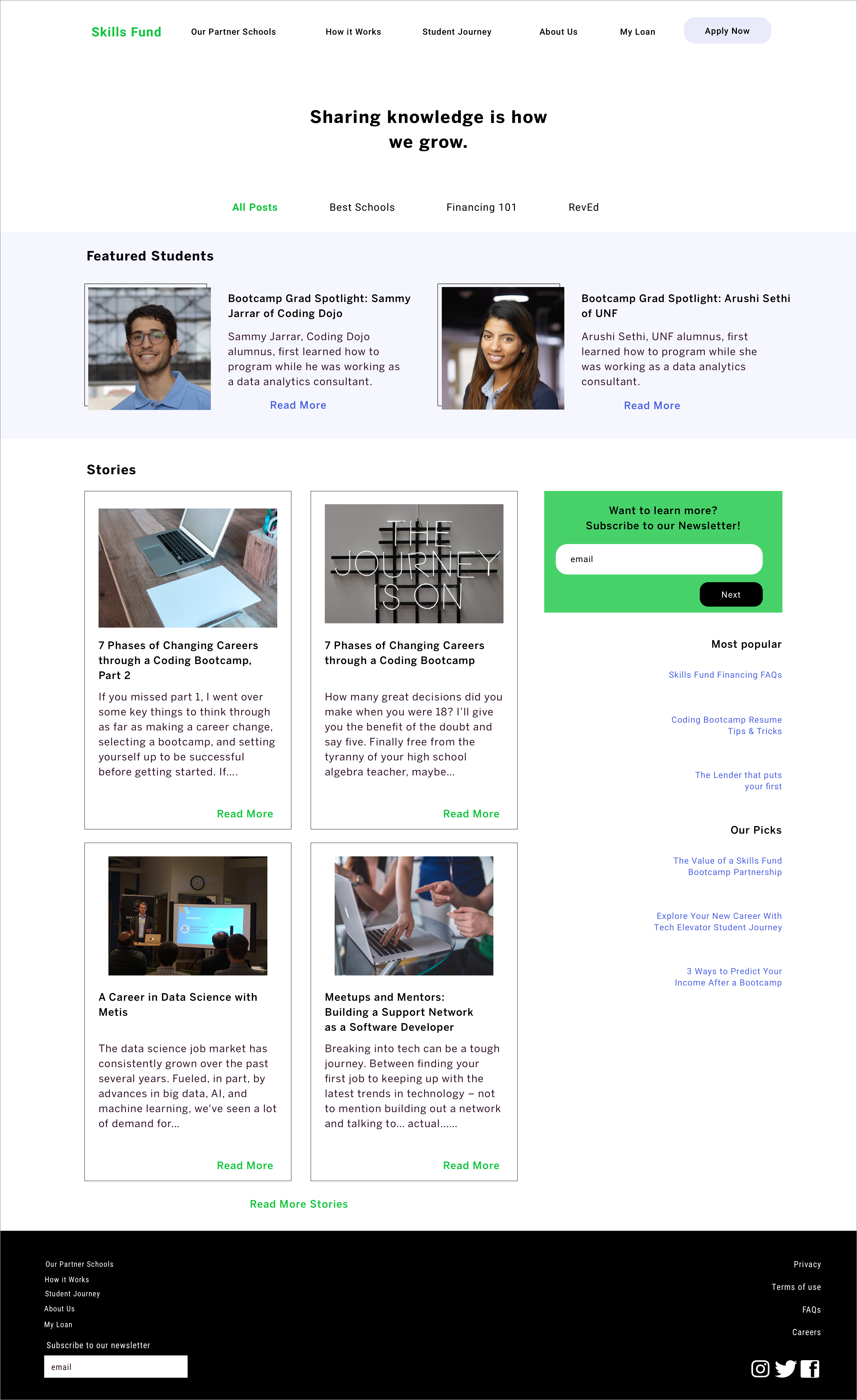
THE PARALLAX SCROLL
First time users found that there was a lot of information to absorb on the first page, and wanted a way to get “digestible bites”. The solution was creating a parallex scroll, so that information would present itself in a delayed manner.
First time users found that there was a lot of information to absorb on the first page, and wanted a way to get “digestible bites”. The solution was creating a parallex scroll, so that information would present itself in a delayed manner.
Example of a dropdown menu transition. Dropdowns are commonly used in this design, especially in the school finder section.
ADDITIONAL SCREENS
PROTOTYPE